One day a couple of years ago JR and I were going through a box of old Life magazine that his parents collected from the 1940s to the 1960s. We have been faithfully hauling around this box for really no good reason. It's not like there aren't plenty of copies of these same issues elsewhere in the world we just like them. They tell a story about a moment in time. As quasi historians this story in time thing appeals to us. Yeah, we are just weird that way.
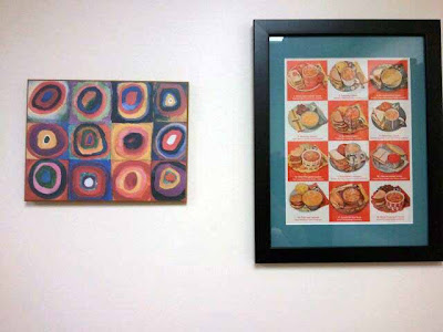
Another way that we are weird has to do with this Campbell's soup advertisement.
 |
| Craptastic photo taken with my phone |
Then wandering through an art museum gift shop (don't ask me which one because I tried all morning to remember. It was either the National Gallery or the Chicago art museum or I'm not really sure but I really think it was the National Gallery.) as I am want to do and I came across this...
It is a wall plaque. I thought that it just like our Campbell's soup picture so I bought it. It was cheap...something like $12 but I really thought they would go together so nicely.
Maybe it is just how I see it but I think they look a lot alike. I think they go together like;
beer and peanuts
Abbott and Costello
wine and Me
Love,
M
This is my Spin for this week. Gretchen has taken over the reins from Jen and is I'm sure making Jen proud. Me...I'm lame. I only write a Spin every couple of weeks or even less. Click on the cute button to read what others have to say about art.


I have been a bad Spinner, too. But I think both the plaque and the vintage ad look great together!
ReplyDeleteI totally get it. And I really love that soup ad. In our kitchen I have a similar framed picture with an old placemat from a diner in NY that is all cocktail recipes. That soup ad would look lovely next to it!
ReplyDeleteOh, and you are linked!!
So if I come across another one I should just send it to you.
DeleteI can see how they do look a lot alike. You must have a decorators eye.
ReplyDeleteThanks for spinning!
I absolutely love that wall plaque! It looks similar to some of my favorite fabric patterns that I have been using in quilt blocks.
ReplyDeleteI think my sister has that same one you just bought in her house too!
ReplyDeleteThe pop art I like are the ones from the period just before. It still had all the airplanes and ship shapes but the Art Deco chromes, silvers, blues and blacks had shifted to one caused by an unholy combo of uppers and downers. The results you see in film also, where the colours are over-saturated.
ReplyDeleteI do see how you arrived with those two all the same. It's has resonances of Australia. And ideal for latitudes where the sun is high.
I love both but would never have thought about putting them together. Cool idea!
ReplyDeleteThis comment has been removed by the author.
ReplyDelete